
Custom Designed Alerts
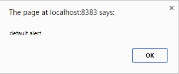
Most of the end users will not be interested in seeing default alert messages that our system provides.
In this article we are going to see some custom designed Alert Box and messages.
For this code to work, please download js and css files from Here. Also please download jquery-1.11.3.min.js file.
Sweet Alert:
We are going to see how to show custom designed alert boxes of Sweet Alert.
This sweet alert takes 3 attributes
swal(‘title’,’text’,’type’ );
Swal – Sweet Alert, you can also use SweetAlert in place of Swal
title – Title for the alert box (required)
text – Message to be displayed to the user
type – There are 4 types of type
Success
Delete
Warning
Error
Now let us see examples of using Sweet Alert,
<html>
<head>
<title>Alert Designs</title>
<script src="sweetalert.min.js"></script>
<script src="jquery-1.11.3.min.js"></script>
<link rel="stylesheet" href="sweetalert.css"/>
<script>
function alert1()
{
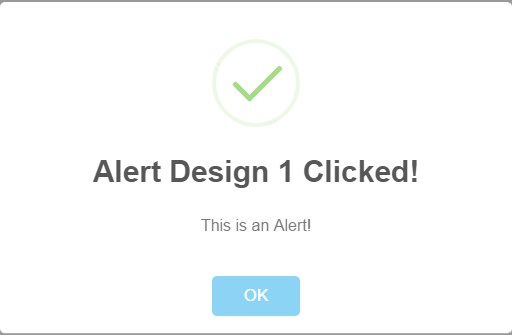
swal('Alert Design 1 Clicked!','This is an Alert!','success' );
}
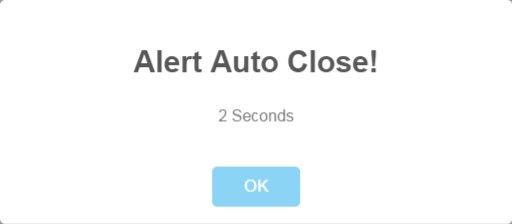
function alert2()
{
swal({
title: 'Alert Auto Close!', text: '2 Seconds',
timer: 2000 });
}
function alert3()
{
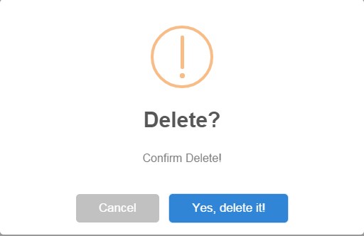
swal
({ title: 'Delete?', text: 'Confirm Delete!',
type: 'warning', showCancelButton: true,
confirmButtonColor: '#3085d6', cancelButtonColor: '#d33',
confirmButtonText: 'Yes, delete it!',
closeOnConfirm: false });
}
function alert4()
{
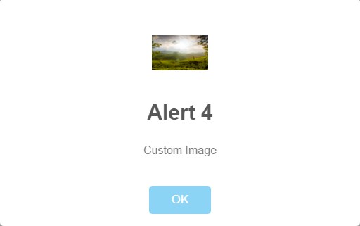
swal
({ title: 'Alert 4', text: 'Custom Image',
imageUrl: 'Hills.jpg', animation: false });
}
function click1()
{
alert('default alert');
}
</script>
</head>
<body>
<button onclick="alert1()">Alert Design 1</button>
<br> <br>
<button onclick="alert2()">Alert Design 2</button>
<br> <br>
<button onclick="alert3()">Alert Design 3</button>
<br> <br>
<button onclick="alert4()">Alert Design 4</button>
</body>
</html>
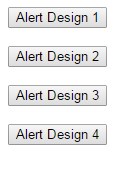
We have designed 4 buttons to display 4 designs of alert.
Alert Design 1 – Will display customized alert box.
Alert Design 2 – Will display an alert box that will disappear in 2 seconds
Alert Design 3 – Will display an alert of type warning
Alert Design 4 – Will display an alert with custom image.
Alert Design 1 Output:
Alert Design 2 Output:
Alert Design 3 Output:
Alert Design 4 Output:
Very nice example …It’s really helpful …If you have javascript related then upload…!!
Sure, Thank you Ramjeet!